Basic concept maps#
Before we look at the three structures, hold onto one idea: the benefit of any map comes from building it, not from how it looks when it’s done. When you make a map you have to select what matters, organise it into a structure, and integrate it with what you already know — that active work is what builds understanding (it’s the “generative” learning the proven methods page describes, and laying ideas out in space alongside words gives you a second route back to them). The shape, the colours, and the neat layout are just scaffolding for that work. So a rougher map you drew yourself beats a polished one you only copied — and the single best move is to build a map from memory first, then check it against your source.
Every map type in this course is the same underlying thing: a labelled graph laid out in space — ideas as nodes, the named relationships between them as edges. What changes from one type to the next is only how you’re allowed to arrange that graph on the page: a spider radiates from a centre, a hierarchy flows top to bottom, a network lets you place things wherever the meaning fits. The types differ in how they constrain the layout, not in what they’re made of.
Concept maps have three basic structures with many variations on each of them. These basic structures use various visual metaphors to show different types of information or knowledge. As I mentioned in the introduction, each map uses variations on positioning, size, shape, color, arrows, lines and images. These variations determine what information you can embed in the map. This is why some maps are more useful for some tasks and not others. These variations are what give each map its own style.
As we get into more maps in the following chapters, you will see that parts of these basic maps reoccur often. Mind maps are a variation of a spider map. IHMC concept maps are a variation on hierarchical maps. As each type of concept map has evolved, they’ve taken on ideas and themes from other maps and diagramming techniques.
The basic types of concepts maps I cover in this module are:
-
Spider. The central idea is in the middle of the map, with related concepts laid out around the central idea.
-
Hierarchical. These maps show hierarchical relationships in a top-to-bottom structure.
-
Network concept maps. Shows information for which there is no main idea, hierarchy or relationship.
Spider concept maps#
The first basic structure is the “spider” concept map. A spider concept map has a central or unifying concept in the center with related concepts radiating out from the main one. Let’s look at an example:
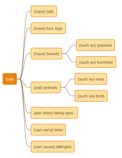
In this case, the central concept is “Cats.” Around the central concept I’ve laid out various pieces of information associated with cats—tails, four legs, breeds, etc. I’ve then broken down some concepts into further detail by branching out, like in the “breeds” concept above. You can continue doing this to add more detail. If the map gets too large, you might want to start a new map using one of the concepts from the diagram above as the central idea.
Spider maps can be very simple as in our cat example or as complicated as necessary for difficult subjects. Spider concept maps are great for brainstorming ideas or for when you need to build concepts and add ideas as they arise over time. They’re also great for capturing information quickly, for example while listening to a lecture. If you find it difficult to capture the linking labels quickly, just draw the main concepts in first and work out the labels later.
Hierarchical concept maps#
The second basic structure is the hierarchical concept map. Hierarchical concepts maps show information in a descending order of relevance or importance. The key concept is at the top, and subordinate concepts fall below it.
Let’s look at an example. In this case, it’s a corporate organization chart. It tells you who is in charge of the company and who reports to the leader.
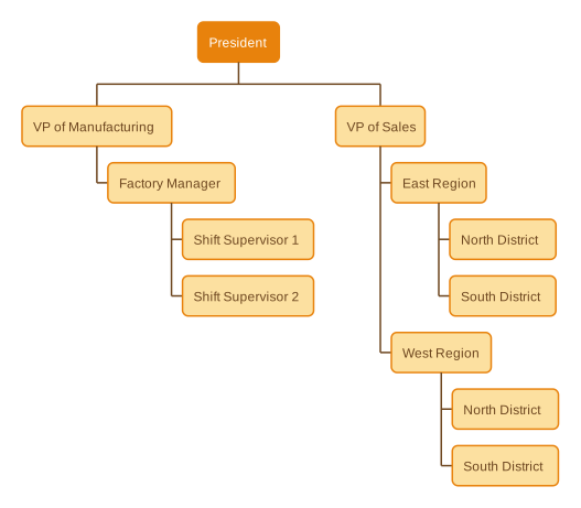
In our example, the top concept is the leader of the organization – the President – and subordinate concepts show the “chain of command.” The immediate “reports” to the President are the Vice President of Manufacturing and the Vice President of Sales. The map then shows who reports to the Vice Presidents. This kind of corporate concept map helps viewers quickly identify the members of the organization and who is responsible for specific areas.
This map is also an example of a concept map without labeled links. Each line has relationship information embedded in it, and it’s specific to this style of map. You can think of each line showing the following information:
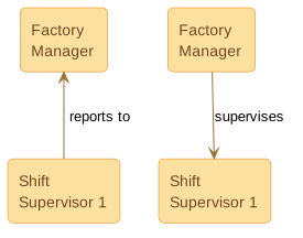
For some concept maps, every line shows this relationship. In others, each line has a label indicating the nature of the relationship. It just depends on the objective of the map. You can imagine how messy the above organization chart would be if every line had “reports to/supervisors” on it.
The hierarchical concept map provides a handy way of categorizing items and explaining structures. Because of their utility, people use such maps across a wide variety of fields. For example, scientists use hierarchical maps to categorize and explain the plant and animal kingdoms. Government officials use them to explain the structure of government. Military officers use them to explain the structure of their forces and clarify the chain of command. Hierarchical maps allow viewers to understand an entire concept in less time than it would take to read an explanation of it in words. Hierarchical maps can also help you understand groupings and classifications.
Let’s take a look at another example from biology.
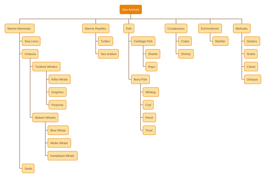
At one glance, you can see the hierarchical structure of “sea animals”. If someone asks you how dolphins fit into the overall sea animals family, you can easily see that they belong to a group called “Toothed Whales.” These belong to a group called Cetacea, which describes a type of “Marine Mammal.” You can also see that dolphins are closely related to Killer Whales, but less related to sharks.
Network concept maps#
The last basic structure is the network concept map. Our example below represents corporate use of a network map. As you can see, network diagrams show nodes connected by arrows. Depending on the type of network diagram, the nodes might represent any type of concept, attribute, value or task. The arrows between the nodes represent any type of relationship. There is often no particular starting point.
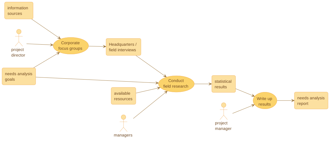
In this case, a client has asked a research company to conduct a needs analysis for his corporation. For example, the client may feel that his company has not met its production goals, so he wants to find out the reasons behind this lag. The research company has created a concept map that accounts for every aspect of the needs analysis: goals, information sources, personnel, research, statistical results, etc.
The research company executives can use this network concept map in several ways. First, they use it to organize their own approach to the situation. Second, they can now employ it to explain the project to other members of company’s team. Third, they can use it to explain the project to the client. In each instance, viewers of the network map will have a clear, quick image of the elements involved in creating and carrying out a needs analysis.
The key point of network concept maps is there is no common theme that guides the layout of the map. For spider maps the idea is to lay out ideas in a circle around the main idea. For hierarchical maps the hierarchy flows from top to bottom. For network maps though, the choice is up to you. You can choose how you wish to lay out the map and what visual elements you use to show concepts and relationships.
Summary#
There are three basic forms of concept maps. Spider maps have a main or unifying theme in the center with sub-themes radiating out from the main theme. They’re useful in brainstorming situations. They’re helpful when you need to add ideas as they arise over time. Hierarchical concept maps show information in a descending order of relevance. They provide an efficient way of categorizing items and explaining structures. Network concept maps show relationships between ideas by including cross-links between concepts. With this type of map, there is often no common starting point or guiding theme for layout.
In the next module, you will explore some common concept maps. The most well-known of these is probably the mind map, however you will see there are many other forms of concept map. Each you will find useful for different types of information.
Exercises#
The following exercises give you the opportunity to practice making concept maps. Each exercise spells out the type of concept map, provides the necessary information, and asks you to construct a map for the specified situation. A suggested solution follows each one. Remember that these are not the only “correct” solutions: such maps are flexible and can be highly individual. Build your own map first, then use mine as a guide to check it against — that build-then-check habit is where the learning happens.
Exercise 1 – Spider concept map#
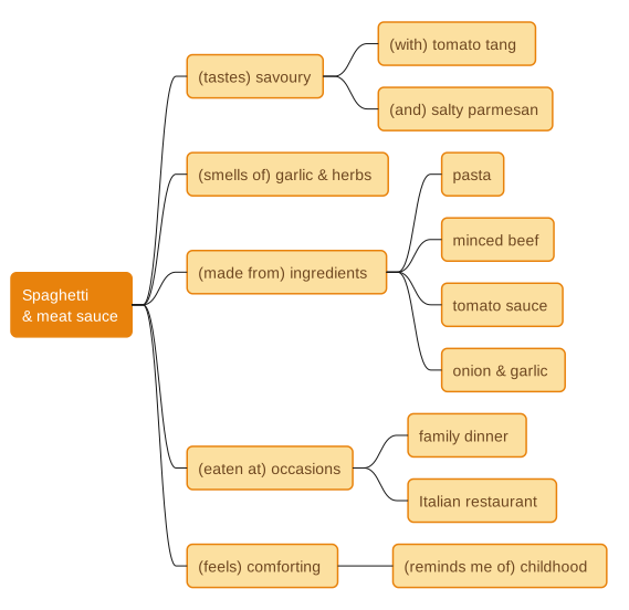
Here’s an easy one to start you off on the exercises. Assume that the central concept is food—spaghetti and meat sauce. Using that concept, draw a spider map and all that is associated with this Italian food in general and for your specific experience; e.g. taste, smell, etc.
Suggested solution. Put the dish in the centre and let the associations radiate out: the senses (taste, smell), the ingredients, the occasions you eat it, and how it makes you feel. There’s no right number of branches — a spider map is for getting everything down, so yours will naturally differ from mine.
Exercise 2 – Hierarchical concept maps#
In this exercise, we’ll ask you to create an organizational chart for a water board in two different forms. One will be an organizational chart by department. The other will be by region. Here’s the information required to construct the charts:
By Department
-
Water Quality Department, Billing Department, Distribution Department
-
Water Quality Department regions: East Region, Mary; Central Region, Terry; West Region, Bob
-
Billing Department regions: East Region, David; Central Region, Sam; West Region, Linda
-
Distribution Department: East Region, Tom; Central Region, Sarah; West Region, Scott
By Region
-
East Region, Central Region, West Region
-
Water Quality, Billing and Distribution Departments for each region
-
Personnel remain the same as in the Departmental hierarchy map
Remember the rules for hierarchical concept maps. They show information in a descending order of relevance or, in the case of the water board, authority. The key concept is at the top, and subordinate concepts fall below it.
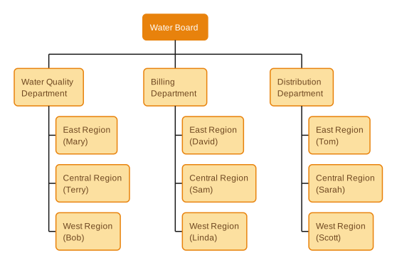
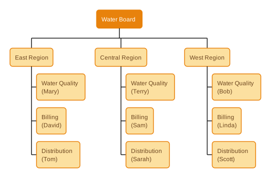
Suggested solution. Both maps hold the same nine people — only the top two levels swap. Organised by department, each department branches into its three regions; organised by region, each region branches into its three departments. Notice how the same facts give two quite different pictures depending on what you choose to put at the top. That choice is the real decision in any hierarchical map.
Here it is by department:
And the same people organised by region:
Exercise 3 – Network concept map#
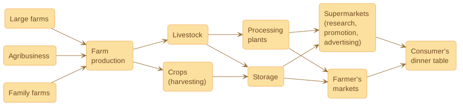
Assume you have an assignment in which you have to describe the food production cycle starting from farm production and ending with food on the consumer’s dinner table. Draw a network concept map that takes into account the following elements:
-
Farm production results from large farms, agribusiness, family farms.
-
They produce livestock and crops (harvesting).
-
Livestock goes to processing plants and storage, and crops go to storage.
-
Livestock and plants are transported to supermarkets (which do research, promotion, advertising) and farmer’s markets
-
Food flows from supermarkets and farmer’s markets to the consumer’s dinner table.
Suggested solution. Because a network map has no single centre, the easiest layout follows the flow: lay the stages out left to right, from the three kinds of farm, through production, livestock and crops, into processing and storage, on to the two kinds of market, and finally to the consumer’s table. The arrows carry the meaning here — they show where the food goes next.